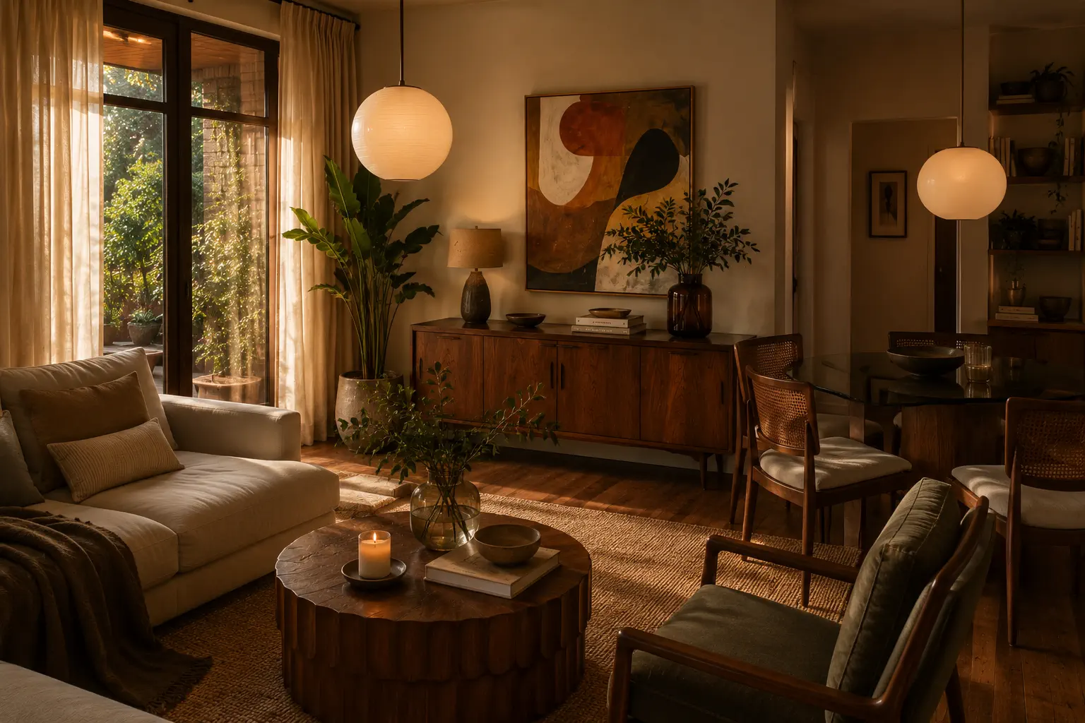
The gap between an amateur and a professional interior design portfolio is rarely talent — it is discipline. The best portfolios follow a handful of repeatable best practices that make work look considered, credible and easy to hire. This guide collects those professional interior design portfolio best practices in one place. For the bigger picture of what a portfolio is and what it should contain, start with our pillar guide on the interior design portfolio; here we focus on doing it professionally.
What "professional" actually means
It is worth being precise, because "professional" is often mistaken for "expensive" or "elaborate". It is neither. A professional portfolio is one that has been deliberately edited — every project, image, caption and click is there for a reason, and anything that does not earn its place has been removed. Amateurs add; professionals subtract. The amateur instinct is to show more work, more angles, more words, in the hope that volume signals competence. The professional instinct is the opposite: show less, but make everything that remains excellent. This single mindset shift sits underneath every practice below. As you read, notice that almost all of them are really about restraint — leading with one project rather than ten, writing four sentences rather than four paragraphs, leaving whitespace rather than filling it. Restraint is what reads as confidence, and confidence is what reads as professional.
Lead with your single strongest project
A visitor decides whether to keep scrolling in seconds. Open with your best work — the project with the strongest photography and the clearest transformation. Never bury your best piece in the middle of a long grid; the opening project sets the standard for everything that follows, and a weak start quietly lowers the perceived quality of the rest.
Curate ruthlessly: quality over quantity
Professionals show fewer projects, better presented. Eight to twelve outstanding projects beat twenty average ones every time. Each project you add should be at least as strong as the weakest one already there — otherwise it drags down the average. If you are unsure whether a project belongs, it does not.
Make it visually consistent
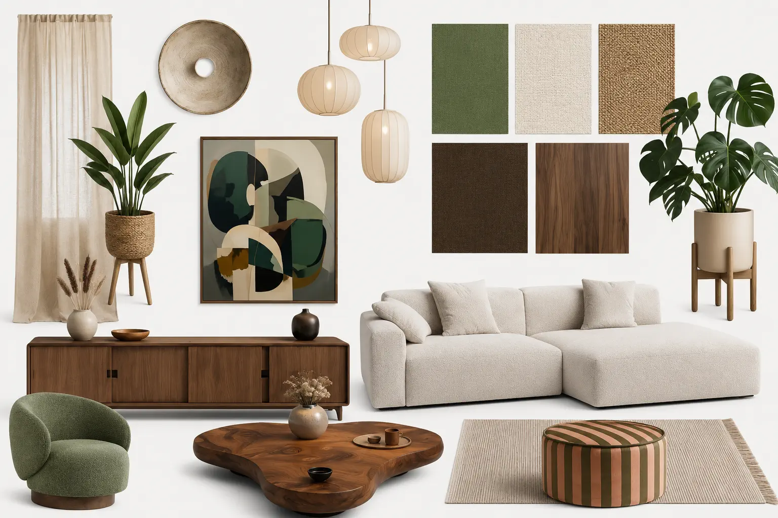
Consistency is the quietest professional signal of all, and the most overlooked. When every project shares the same photographic treatment, the same caption style, the same spacing and the same image proportions, the portfolio reads as one coherent body of work created by someone in control of their craft. When those things vary project to project, the work feels assembled rather than designed — even if each individual image is good. Pick a consistent grid, a consistent way of writing project meta, and a consistent visual tone, then hold to them across the whole portfolio. The discipline is invisible when it is present and glaring when it is missing.
Match the portfolio to the clients you want
A professional portfolio is positioned, not generic. The projects you lead with and the language you use should be weighted toward the work you want more of, because clients self-select from what they see first. If you want high-end residential work, open with your most refined residential project and describe it in the language those clients use; if you want commercial contracts, make that work prominent and speak to budgets and timelines, not only aesthetics. Trying to appeal to everyone makes you the obvious choice for no one. A focused portfolio pre-qualifies your enquiries, so the people who contact you already like your direction — which makes every conversation that follows easier.
Make every project a mini case study
Photography shows what you made; a short narrative proves how you think — and thinking is what clients pay for. For each project, cover four things in a few tight sentences:
- The brief — what the client wanted and the constraints.
- The challenge — the spatial or budget problem you solved.
- Your approach — the key decisions on layout, palette, lighting and materials.
- The result — the outcome, ideally with a before-and-after.
Add project meta too: location, year, square footage and the services you provided. This context is what separates a professional case study from a pretty mood board.
The difference is concrete. "A calm, modern bedroom in soft neutrals" tells a client nothing they could not see for themselves. "The client struggled to switch off in a north-facing bedroom that always felt cold and cluttered; we warmed the palette, built in concealed storage to clear the floor, and layered lighting for evenings, turning it into a room they now describe as their retreat" tells them you diagnose problems and solve them. Same room, same word count — but the second proves the thinking clients actually pay for. Make every project description do that job.
Invest in photography
Inconsistent, low-resolution images undermine even brilliant design. Professional portfolios use high-resolution photography, shot in consistent light, with both wide establishing shots and detail shots of materials, joinery and styling. If you cannot hire a photographer for every project, learn the basics of interior photography and shoot in good natural light — consistency across your gallery matters more than any single hero shot.
If you are shooting your own work, a few fundamentals carry most of the quality:
- Use daylight where you can. It is the most flattering light for interiors and the easiest to keep consistent across projects.
- Keep verticals straight. Converging walls are the fastest tell of an amateur photo; a tripod and a moment of care fix it.
- Shoot wide and tight. A wide establishing shot explains the space; detail shots of materials, joinery and styling prove the craft.
- Style the shot. Clear clutter and add a few considered props — the shoot is part of the design work, not an afterthought.

Design for skim-readers
Almost nobody reads a portfolio top to bottom. Structure for scanning: clear headings, short paragraphs, generous whitespace, and a logical grouping of projects (by room, style or sector). Let the photography breathe — cramped grids signal an amateur, while space signals confidence.
Make contact effortless
The most common professional failure is hiding the next step. Every page should make enquiring obvious: a visible contact form, a "book a consultation" button, an email. Treat the contact path as part of the design, not an afterthought — a portfolio that does not convert is just an album.
A few details sharpen the enquiry flow further. Ask for just enough information to qualify a lead — name, email, a sentence about the project, and a rough budget or timeline — without making the form feel like paperwork. Set expectations by noting when you typically reply. And place a contact prompt at the natural decision points: the end of each project, the foot of the About page, and a persistent link in your navigation. The goal is that at the exact moment a visitor thinks "I want to work with them," the way to say so is right in front of them.
Keep it current
A portfolio that ends two years ago signals a stalled practice. Refresh it as projects complete, swap weaker work for stronger, and update your About section as your positioning evolves. A living portfolio is itself a credibility signal.
Show your process, not just the result
Amateur portfolios show only finished rooms. Professional ones show a little of how the room came to be. A concept board, a before-and-after, a sketch beside the final render, a short note on the key decision — these prove there is rigour behind the beauty. Clients are not only buying a look; they are buying judgement, and process is the clearest evidence of judgement you can offer. You do not need to document every project this way. One or two projects with a visible "concept to completion" sequence is enough to reframe the whole portfolio as the work of a thinker, not a decorator.
Get the About page right
The About page is the second-most-visited page in almost every portfolio, yet it is usually the most neglected. Professionals treat it as a sales page, not a résumé. Lead with who you help and how you make their project easier, then add your philosophy in a sentence or two, your credentials, and a warm, professional photo. Avoid the generic "passionate about design" opening that every competitor uses. Specifics — the kind of client you love, the problems you are best at solving — do far more to build trust and make the right client feel they have found their designer.
Use social proof deliberately
A short client quote next to the project it refers to is more persuasive than another paragraph about yourself. Professionals place testimonials in context rather than quarantining them on a separate "reviews" page, and they add credibility markers — awards, press features, professional memberships — where they reassure without shouting. Social proof works because it lowers the perceived risk of hiring you, which is the real hesitation between an interested visitor and an enquiry.
Optimise for mobile
The majority of clients open a portfolio on a phone, often the first time they encounter your work. A layout that looks confident on a large screen can fall apart on mobile — images shrink to stamps, text crowds, and the contact button disappears below the fold. Professionals check every page on a phone and insist on a layout that reflows to a single column with large images and an obvious contact path. If it does not work on mobile, for most visitors it does not work at all.
Make sure you can be found
A polished portfolio that never appears in search is a missed opportunity. You do not need to be an SEO specialist, but the basics matter: publish on your own URL, give every project a descriptive page title and image alt text, and include a short narrative so there is real text to rank. These habits compound quietly over months into a portfolio that brings enquiries to you, rather than one you only ever send out by link.
Before you publish: a quick professional audit
Run this five-point check before you go live:
- Does it open strong? Is your single best project first?
- Is it curated? Would removing the weakest project improve the whole?
- Does every project tell a story? Brief, challenge, approach, result.
- Is the contact path obvious on every page?
- Does it hold up on a phone?
If you can answer yes to all five, your portfolio already looks more professional than most of your competition.
What clients are actually looking for
It helps to remember who you are designing the portfolio for. A prospective client is not grading your work the way a tutor or peer might — they are asking a more practical set of questions. Can this designer do the kind of space I want? Will my project be in safe hands? Do I like how they think? And how do I get in touch? Every best practice above maps onto one of those questions. Leading with your strongest relevant work answers the first. A clear case-study narrative answers the second and third. An obvious contact path answers the last. When you are unsure whether a choice improves your portfolio, run it through this lens: does it help a real client answer one of those questions faster? If not, it is probably decoration.
Templates versus custom design
Many designers worry that using a template makes their portfolio look generic. In practice the opposite is usually true. A well-built template embodies the professional fundamentals — spacing, hierarchy, responsive behaviour, consistent image treatment — that take years to learn and hours to get wrong from scratch. Your work, your narratives and your curation are what make the portfolio distinctive, not a hand-coded layout. A custom-built site only outperforms a good template when it is designed by a professional and maintained carefully; a custom site built without that expertise almost always looks less polished, not more. For the vast majority of interior designers, starting from a strong template and pouring your energy into the content is both the faster and the more professional choice.
Put the practices to work
If you want a ready-made way to apply all of this, the interior design website builder gives you professional gallery layouts, built-in contact forms and one-click PDF export — so the best practices above are baked into the structure. Before you publish, run the free portfolio checklist, and if you are still choosing how to assemble everything, follow our step-by-step guide on how to make an interior design portfolio.
Frequently asked questions
What makes an interior design portfolio look professional?
Ruthless curation, consistent high-quality photography, a short case-study narrative for each project, generous whitespace, and an obvious way to get in touch. Professionalism comes from discipline and structure far more than from a flashy template.
How many projects should a professional portfolio include?
For most interior designers, 8–12 strong projects is ideal. Every project should be at least as strong as the weakest one already included — if it is not, leave it out.
Do I need professional photography for my portfolio?
High-quality, consistent images are the single biggest visual factor. If you cannot hire a photographer for every project, learn the basics of interior photography and shoot in good natural light — consistency across the gallery matters more than any one hero image.