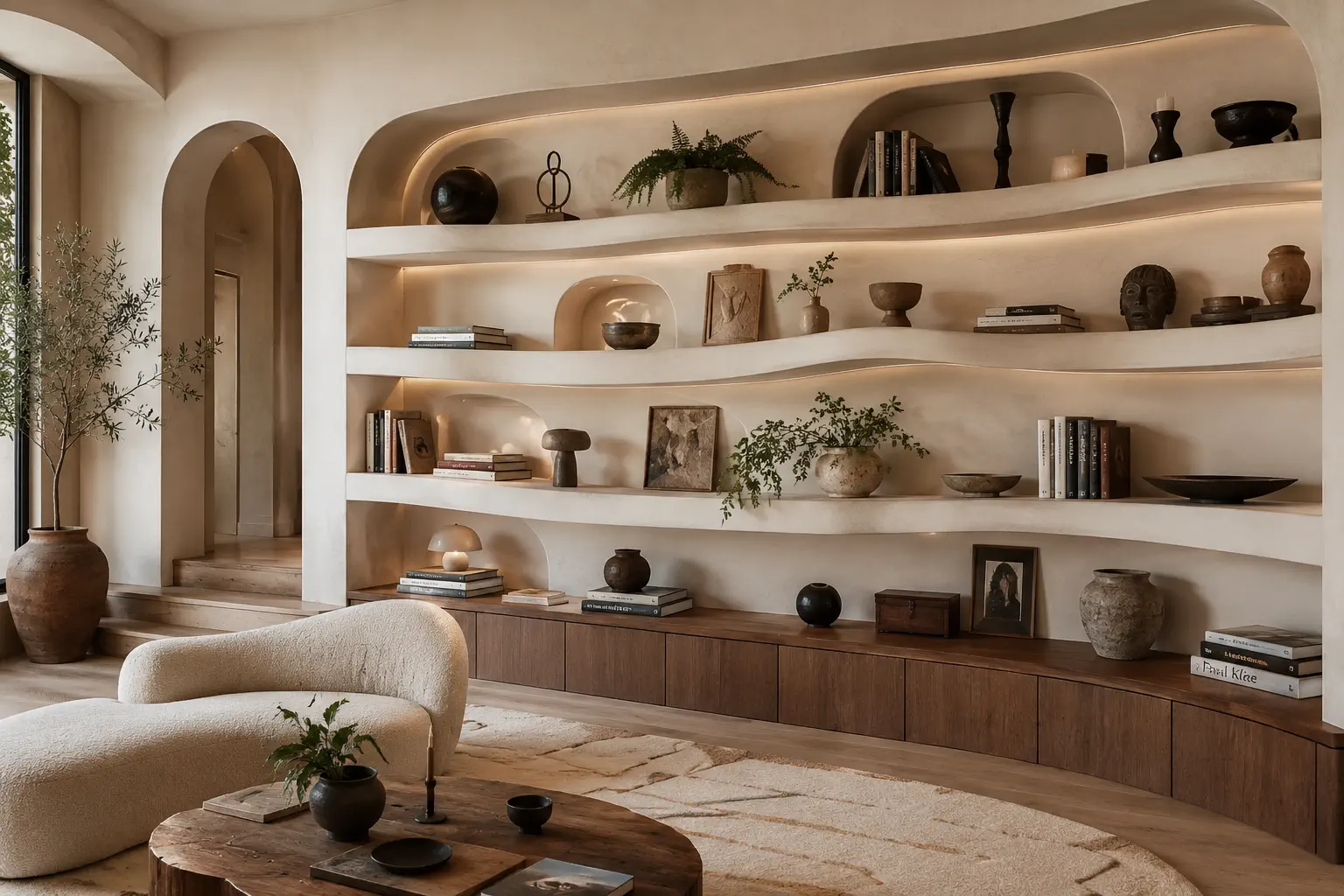
Your interior design portfolio cover page is the handshake of your portfolio — the very first thing a client, recruiter or tutor sees, and the moment they form an impression of your taste before they have read a single word. A confident cover earns the next scroll and frames everything that follows in a flattering light; a weak or cluttered one quietly undermines even excellent work behind it. The good news is that a great cover is mostly about restraint, which means it is well within reach for any designer. This guide covers what to include on a cover page for an interior design portfolio, the layout approaches that consistently work, how to handle typography and colour, and template-style structures you can copy directly. It pairs with our pillar on the interior design portfolio.
Why the cover page carries so much weight
First impressions form in well under a second, and they are sticky. Once a viewer decides your work looks polished and considered, they read the rest of your portfolio generously, giving you the benefit of the doubt. If the cover reads as amateur — busy, mismatched, hesitant — they spend the rest of the portfolio looking for confirmation of that first impression. The cover is therefore doing disproportionate work: it is not just a title page, it is the lens through which everything else is judged. That is exactly why it deserves more care than the five minutes most designers give it, and why "simple but confident" almost always beats "elaborate but busy."
What a cover page should include
Keep it simple and confident. Counterintuitively, the strongest covers contain the fewest elements. A great cover usually has just:
- Your name or studio name — the largest, clearest element. People remember a name attached to work they like.
- A short descriptor — "Interior Designer," "Interior Design Portfolio 2026," or your specialism such as "Residential & Hospitality Interiors." This orients the viewer instantly.
- One hero image — your single best photograph or render. This image is doing the emotional work, so it must be your finest.
- Optional supporting details — a logo, a single contact detail, or a one-line positioning statement that says who you help.
Resist the urge to crowd it. A collage of your work, multiple fonts, and three taglines all fighting for attention reads as nervous. Whitespace and one outstanding image say far more than a busy montage ever could. If you are tempted to add something, ask whether removing it would make the cover weaker — usually it would not.

Cover page layout ideas
A handful of layout approaches work reliably. Choose the one that suits your photography and the clients you want to attract.
- Full-bleed hero. One stunning image fills the entire page, with your name overlaid in clean type on a calm area of the image. Bold, immediate and confident — superb when you have a genuinely exceptional hero shot.
- Split layout. The image occupies one half (or two-thirds) of the page, with your name and descriptor on the other half against a calm, solid background. Balanced and editorial, it gives your type room to breathe.
- Minimal, type-led. A refined typographic cover with only a small detail image or none at all. Elegant and understated — particularly effective for high-end positioning where restraint signals luxury.
- Moodboard cover. A tight, carefully composed grid of signature materials, textures and a key image, for a more tactile, editorial feel. Best when your strength is material sensibility.
Match the cover's mood to your work. Airy and minimal suits light, contemporary residential work; dramatic and dark suits luxury, hospitality and bold renovations. The cover should feel like a true preview of what is inside, not a mismatch the viewer has to reconcile.
Typography and colour
Your cover sets the visual tone for the entire portfolio, so treat type and colour with the same care you would bring to specifying a room.
- Use one or two typefaces, maximum. A single elegant serif, or a serif paired with a clean sans, is plenty. More than two fonts almost always looks uncertain.
- Keep the palette restrained. Let the photography carry the colour. A neutral or monochrome cover with one strong image reads as far more sophisticated than a colourful, decorated one.
- Prioritise legibility. If type sits over an image, place it on a calm area or use a subtle overlay or scrim so it stays readable. Text fighting a busy background is a common, avoidable error.
- Mind the hierarchy. Your name should clearly be the largest text, the descriptor secondary, and anything else smaller still. A clear hierarchy reads as deliberate.
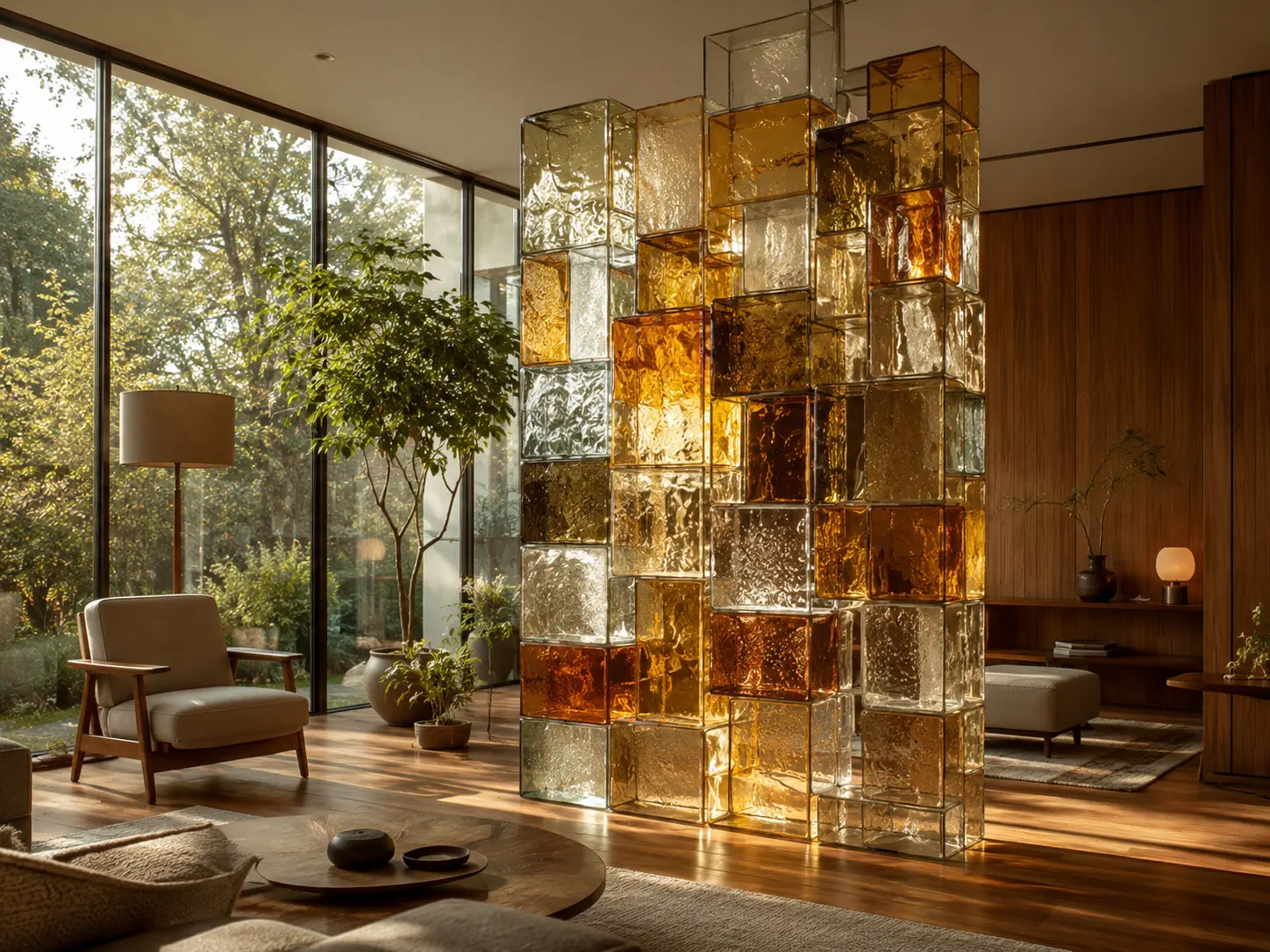
A few interior design portfolio cover page examples you can copy
If you want a starting point, adapt one of these cover page examples:
- The classic: large name centred or lower-left, short descriptor beneath it, over a single full-bleed hero image with a subtle dark gradient for legibility.
- The editorial split: hero image on the right two-thirds; on the left, your name, a one-line positioning statement, and a small logo, all on a warm off-white background.
- The understated: an almost-empty page — your name in a refined serif, a single line of descriptor, and a small, perfectly chosen detail shot. Lets confidence do the talking.
Each works because it leads with one image and one clear name, and gets out of the way.
Digital vs PDF covers
The principles are the same, but the execution differs by format. For a PDF or printed portfolio, the cover is a dedicated first page with no other job to do, so make it count as a pure first impression. For an online portfolio, your "cover" is effectively your homepage hero section — the same restraint and impact apply, but it must simultaneously offer clear navigation and a visible contact path, because a website visitor needs to act, not just admire. In both cases the opening image and your name carry the moment; the website version simply has to be functional as well as beautiful.
A common mistake: the over-designed cover
The single most frequent cover-page error is trying too hard. Multiple images, several fonts, a tagline, a full bio, social icons and a background pattern — all crammed onto the first page in an attempt to seem impressive. The effect is the opposite: it reads as anxious and unedited. A professional cover trusts one great image and a clear name to do the work. When you are deciding what to include, the better instinct is almost always to remove, not to add.
A free way to get a polished cover
You do not need design software or a designer to produce a confident cover. The interior design website builder gives you homepage hero layouts that function as a ready-made cover — drop in your best image and your name, and the proportions, spacing and legibility are handled for you. From there you can export a PDF whose first page acts as your cover for pitches and applications, so a single source gives you both. Browse portfolio examples for cover inspiration before you commit to a direction.
Frequently asked questions
What should be on an interior design portfolio cover page?
Your name or studio name as the largest element, a short descriptor, and one outstanding hero image. Optionally add a logo, a contact detail or a one-line positioning statement. Keep it uncluttered.
What makes a good portfolio cover page?
A single strong image, confident typography (one or two typefaces), a restrained palette, and plenty of whitespace. The cover should match the mood of your work and set the visual tone for everything inside.
Is the cover page different for an online portfolio?
Yes — for an online portfolio your homepage hero acts as the cover, so it must also include clear navigation and a visible contact path. For a PDF or print portfolio, the cover is a dedicated first page.